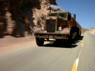
Duel, 1972, Steven Spielberg
Camera - The camera is positioned on the front of a car, at around bumper level. Someone gets into the car, and reverses out of their driveway. The sequence is sped up heavily, but it is still clear to see that the car heads on a normal journey, through a busy city, before heading into a very remote area of countryside, or possible desert, where there is no other traffic on the road. This opening shot actually appears to last for a couple of minutes, but where it is sped up, there are probably edits concealed to move the journey on faster. Eventually, when the car is deep in the desert, the shot changes to high angle panning shot of the car, moving along the road from left to right, with a mountainous backdrop. This shot, combined with only the noise of the car, emphasise how remote the area is, and it's important the audience perceive this sense of solitude, as it adds to the confusion that surrounds the opening, creating questions in the audience's mind. There is then a shot of the car's rear view mirror, allowing the audience to see the driver for the first time, who looks dressed for business, and very 70's. There is then a close up of his face, with little expression, as he drives on.
Editing - There are not many edits at all in the opening minutes, simply because the first shot appears to be so long. The edits are used and slow fade in/fade outs and dissolves, which gives the impression of time passing, making his journey seem all the more tedious. Also, there may be concealed edits in the first shot, to move the journey on quicker.
Sound - Diegetic sound of the man entering his car, shutting the door, starting the engine and driving away. However, the car radio is on throughout the opeing, but it is none-diegetic, as it runs at a normal pace and is continous, despite the first shot being sped up and there being edits after this. On the radio itself is a dreary presenter, talking in a continuous monotone. This again gives the impression that the journey is long, boring, and tedious. At one point, the driver changes the station to some Jazz, but soon changes back again, also showing he is becoming tired and bored of the journey, trying to pass time.
Mise-en-Scene - The busy city and desert contrast is important in emphasising length of the journey, remoteness. Other than this, there is little features of importance. Perhaps the man's smartish clothing and glasses, and the shot in the rear view mirror could be argued to be important. Also the use of the car - the whole opening sequence is based around the car and the journey. When we see the truck for the first time, later on in the opening, it is really loud, dirty, old and smokey, making it look suspicious to the audience, and have a sort of 'scary' image. The audience don't see the driver of the truvk either, which raises the question of 'who is he?' in the audience's mind, and adds to the mystery and suspense.
Titles - Appear only when the car is entering tunnels, of which there is a string of. The text is a yellow, 'Flintstone' style font, which is a strange choice for a thriller.
Speed, 1994, Jan De Bout
Camera - Moves down a lift shaft, with very dark lighting, the audience see lots of floors 'going by' suggesting the building is very tall. The camera is from the point of view of the lift, as if it were attached to it travelling down the building. As the lift raches the bottom, the camera appears to continue in the same shot, moving and panning to the left, where it focuses on a 'caution' sign above a dorrway, then pans down to a bloke opening the door. This looks like one continous shift, however, the camera moves past a gurder as it veers to left, where a sneaky edit is most likely concealed.
Editing - Appears the be one continuous shot throughout the opeing, but one sneaky edit is hidden by the gurder at the bottom of the shaft. This is a really fast edit, and the second shot starts in the finishing place of the first, making the edit seamless.
Sound - Violins, music is rather fast, upbeat, but still creates tension, with the feeling it's building up to something. The opening would be really inneffective and tedious if the music wasn't present, or if it was slowed down. The music makes the opening. Also, there is a 'wooshing' sound effect as the titles rush off-screen.
Mises-en-Scene - Lift shaft, dark lighting, and a knife used in the stabbing involving the man who comes through the 'caution' door. The 'caution' sign, followed immediately by a stabbing is rather ironic, as that's probably not the sort of thing he was being cautious of.
Titles - Blue 'neon' style block font, to the right hand side of the screen, and they appear as the lift goes past each floor, then quickly dissappear. The film title 'Speed' appears in much bigger letters than the actors names.
Comparison
I personnally think that the opening of Duel is much more effective, in that it ticks more boxes of the traits to which thrillers should conform. Although the opening is quite tedious, it suggests the film could be quite a psychological thriller, or at least a slower paced path of confusion, where the audience can think about what twists may be occurring. Also, unlike in Speed, there is a clear indication as to where the film is heading. The title 'Duel' combined with the emphasis on the truck allows anyone with a duty-free brain cell to see that there is going to be some form of conflict between the truck and car driver. It is not clear where speed is heading. Also, despite the clarity of the opening of Duel, it still raises more questions in the audience's mind, and there is more suspense in the opening, as no action really happens, whereas in Speed, someone is killed with very little warning - rather unusual for a thriller - there is normally some form of build up, and the audience generally know when some thing like a murder is likely to happen.

1 comment:
A good analysis of each opening and a clear attempt to compare as a way of expressing your preference.
Post a Comment